Automation Creator
What is the Creator?
The creator is the mechanism that allows you to build personalized and branded interactions with your users throughout the Zowie Platform. You can configure the content using multiple response types including text, images, videos, audio, as well as links to other parts of the Zowie platform called Modules to further tailor your customer experience when interacting with the bot.
If you have Segments enabled in your environment, you can use the creator to customize responses based on user properties.
How to Access The Creator?
The Creator can be found in various places on the platform whenever you’re trying to create chatbot message content.
The most common place you'll find the creator is when building automations, found in the Knowledge Base section of Zowie on the main navigation panel.
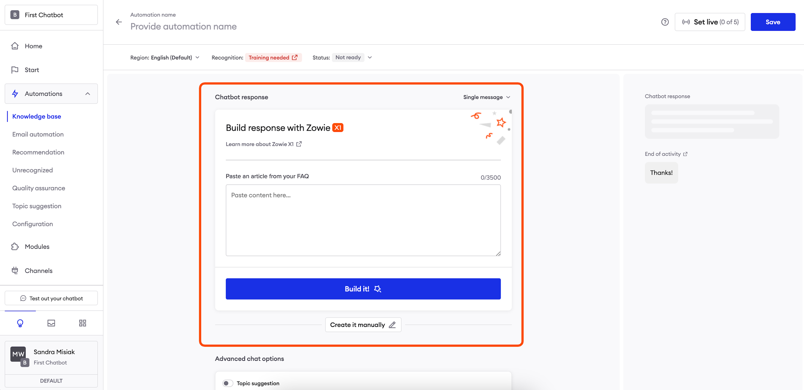
Create a message
Creating messages
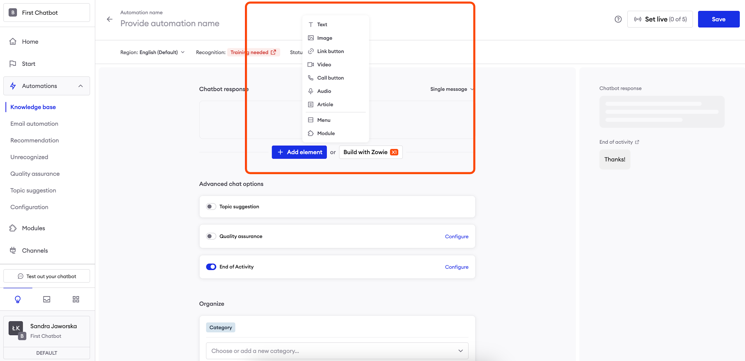
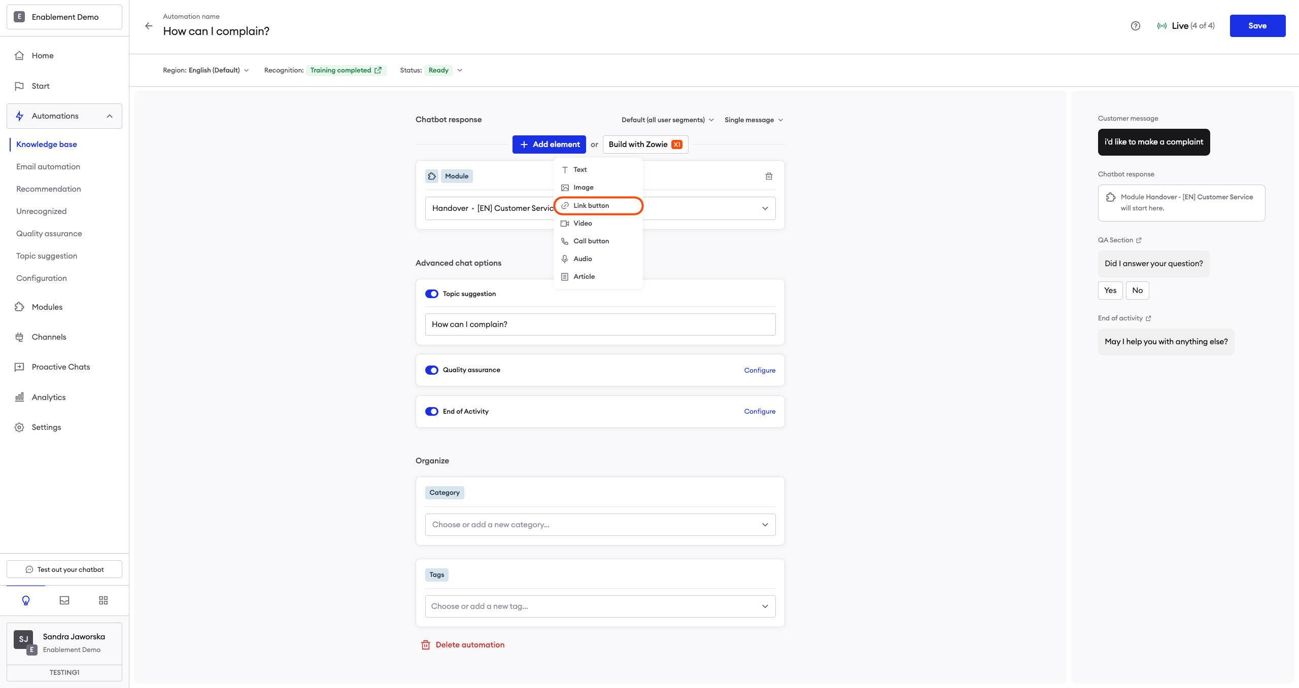
Each building block (e.g., Text, Image, or Video) is sent to users as a separate message— starting from the top and going down. You can drag and drop elements to change their order. On the right, you can see a preview of how your content looks for users.
You can freely mix elements in your Creator lists. For example, you can have an Image element before or after a Text element. The following elements are the only exceptions:
- Menu;
- Module;
- GDPR;
- OTN elements.
These need to be at the end of the Creator list.
ImportantRemember to configure the content for each available Segment. Otherwise, the chatbot will use the default Segment.
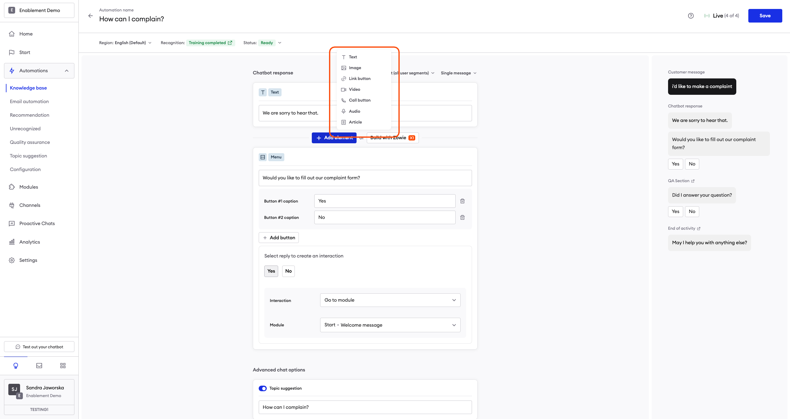
Text
The Text element is a basic plain text message sent to the user. By clicking the emoji icon on the right side of the text input field, you can add an emoji to the message.
AttentionIt’s a good practice to split your content into separate messages, similarly to the way humans write to each other; the conversation with the chatbot will feel more natural that way.
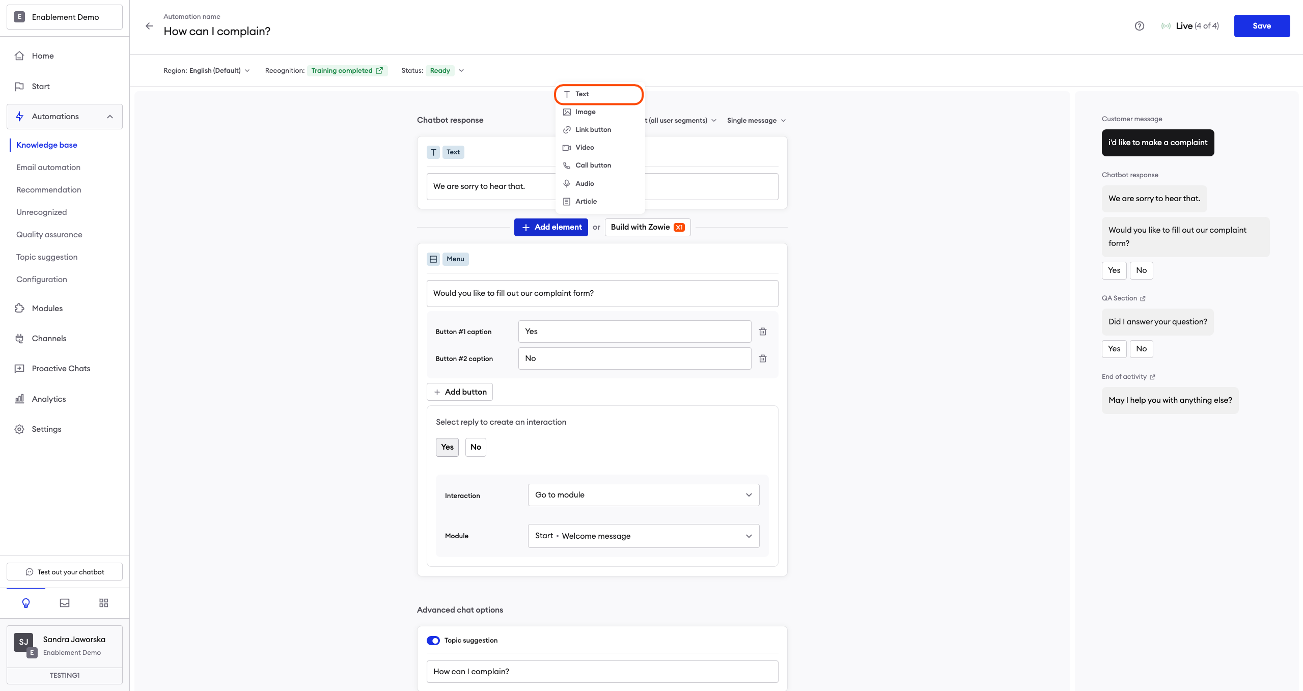
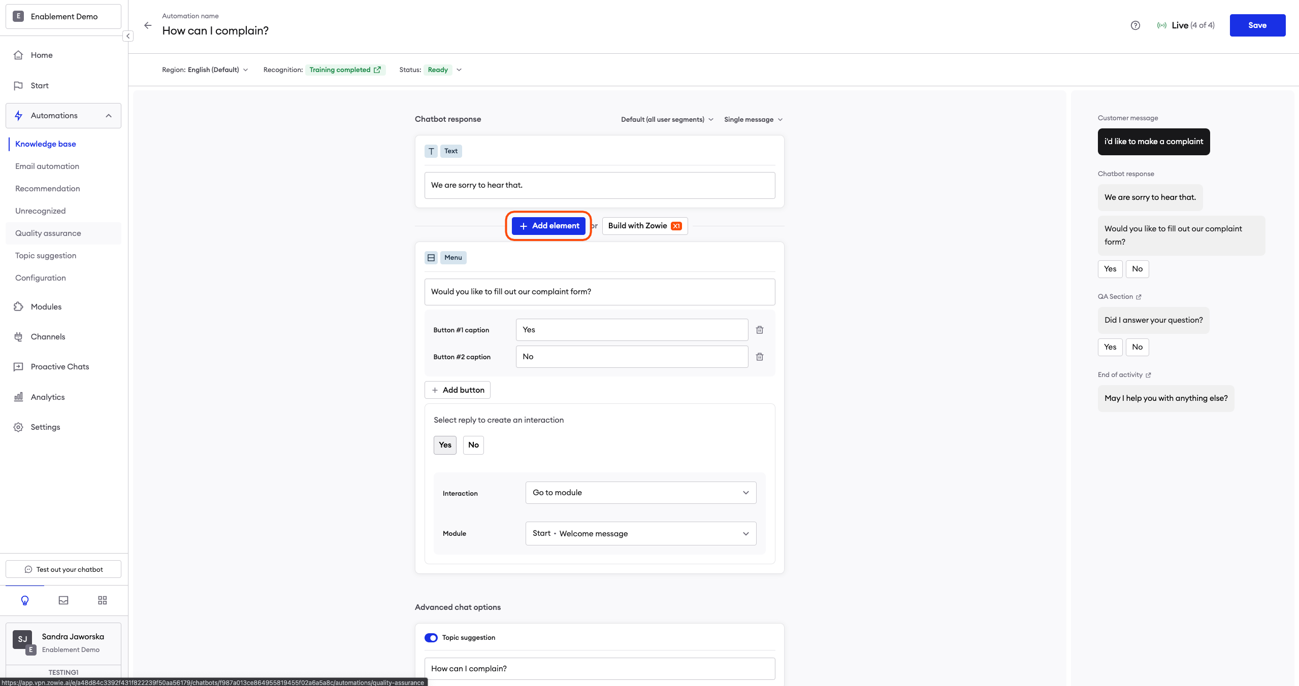
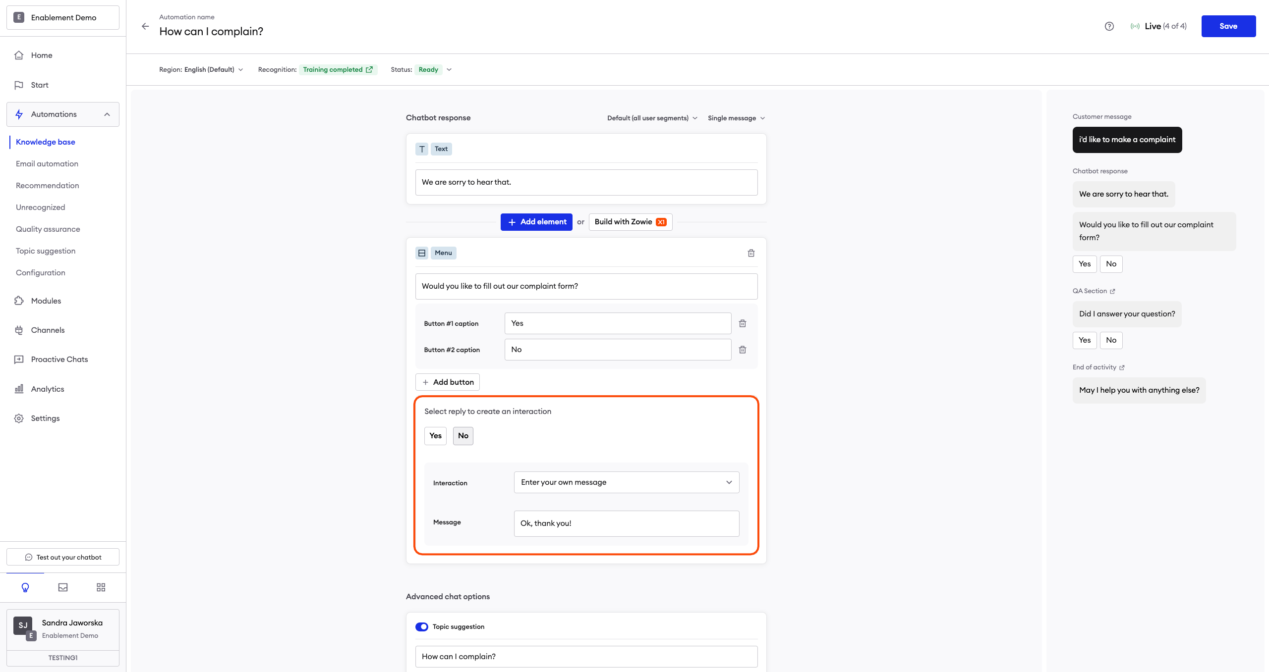
Menu
The Menu element is a text message with buttons attached to it. Those buttons will—when clicked—move the user to the functionality connected to the button. In other words, the user receives a message that offers them a number of choices regarding what to do next.
Configuration is easy. First, type the message you want to send. You can then add, name, and connect whatever buttons you want to display.
Each Menu element can have a maximum of 8 buttons attached to it.
After typing a button’s caption, select what you want the button to do after a user clicks it:
- Type your own message – type a message that’s sent to the user after the button is clicked.
- Go to a module – connect the button to a previously configured Module.
Note that the maximum length of the caption is 20 characters.
The second option allows you to connect different modules and create advanced conversation scenarios. We encourage you to experiment with it!

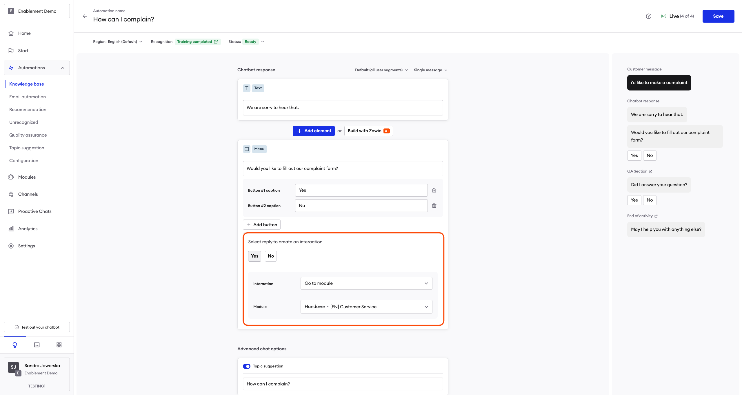
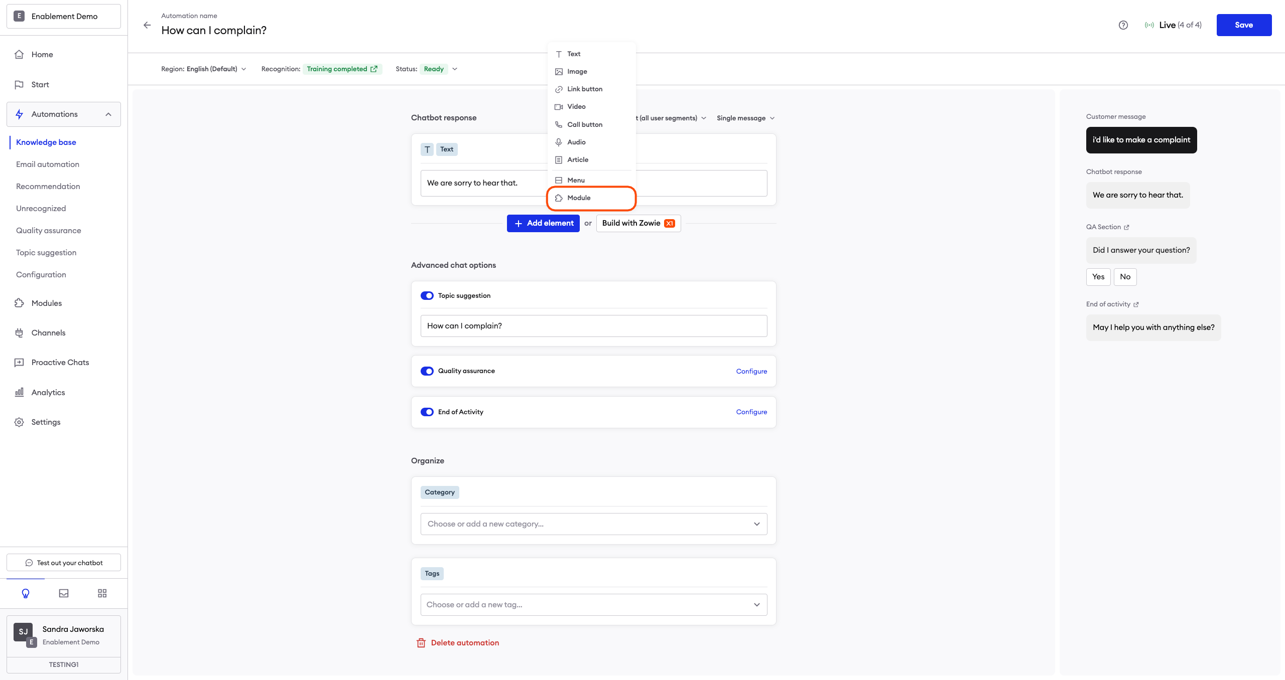
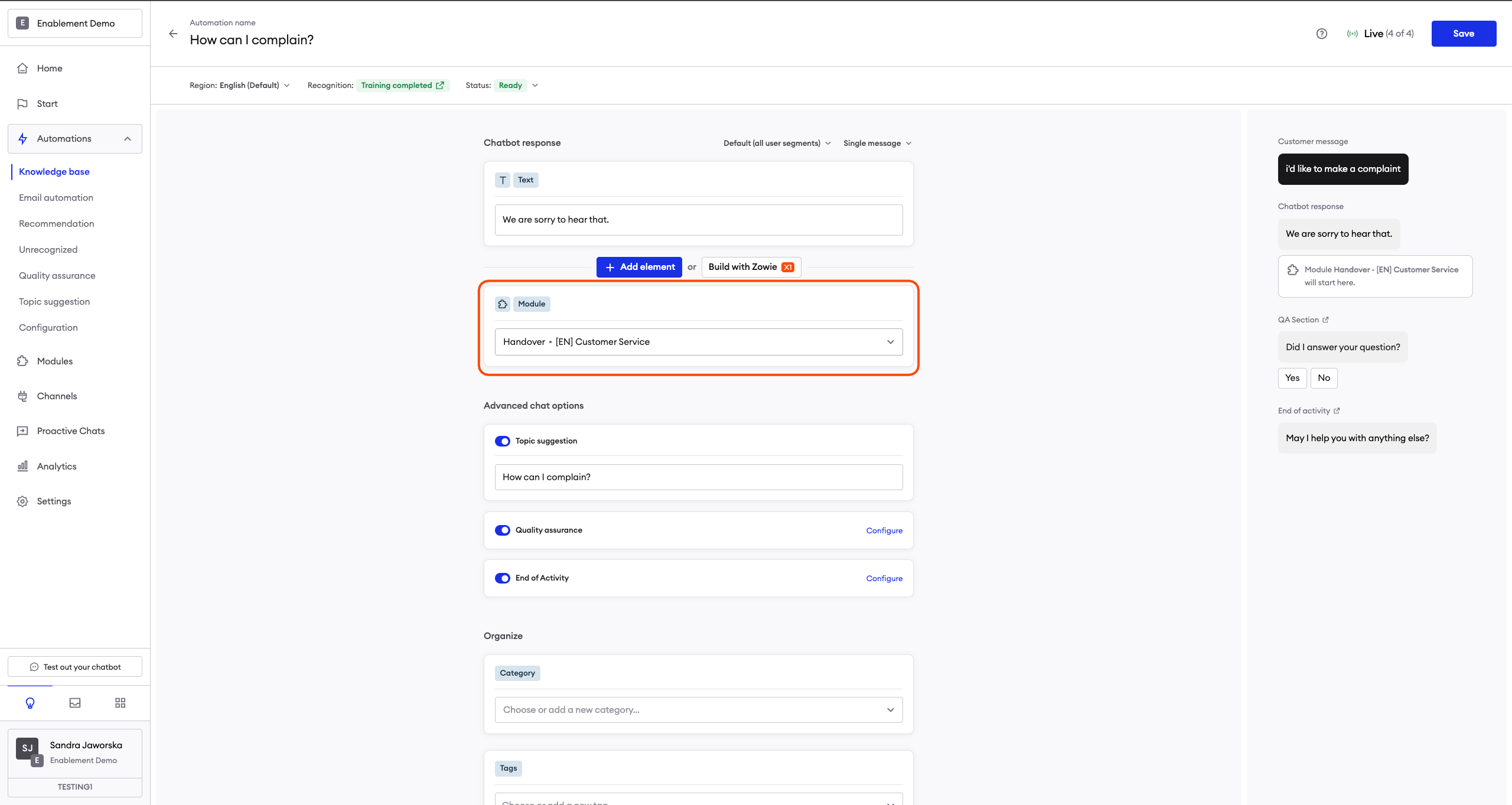
Module
The Module element allows you to directly move the user to a different Module once all messages in the Creator list are sent. Essentially, it acts as a redirect feature for Creator lists.
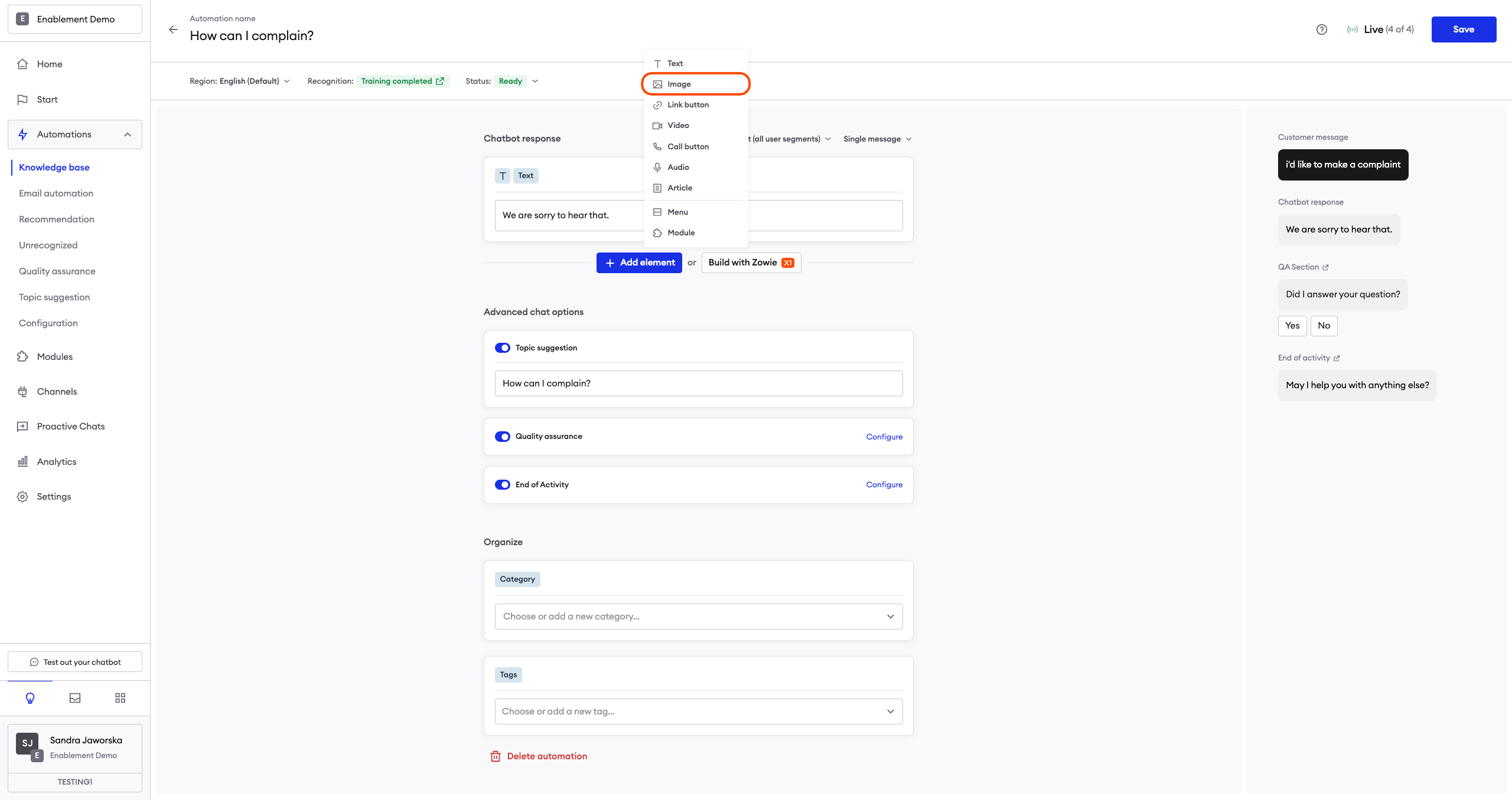
Image
This allows you to send users an image. Supported file formats are PNG, JPG, and GIF, and the maximum file size is 8 MB.

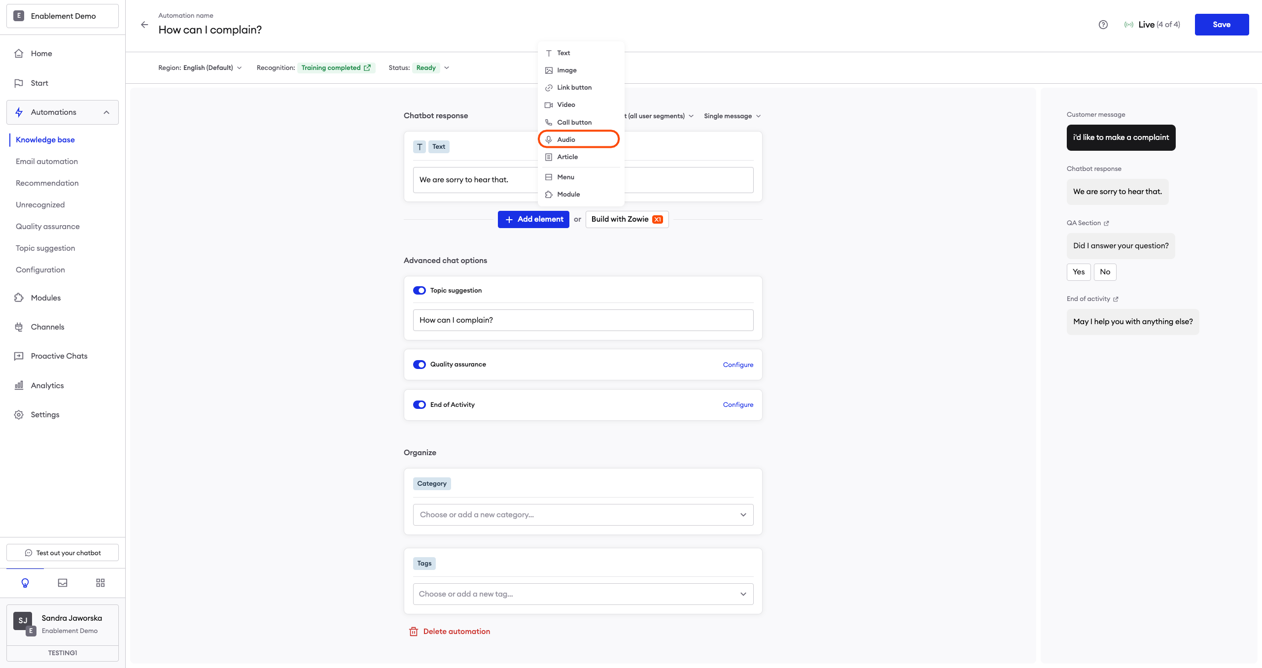
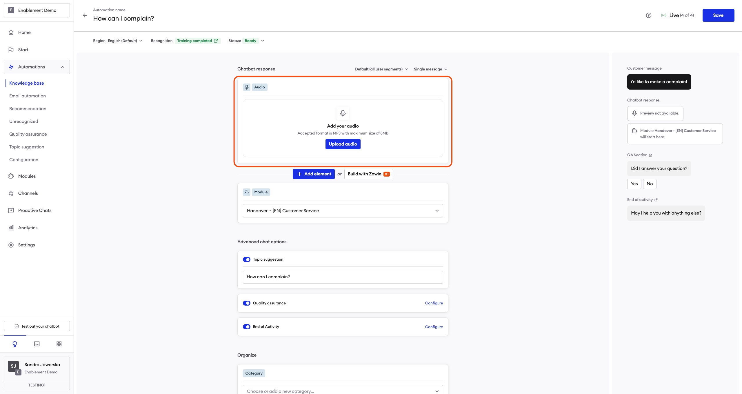
Audio
This allows you to send users an audio recording. The supported file format is MP3, and the maximum file size is 8 MB.
Note that this might not always be available in Creator.
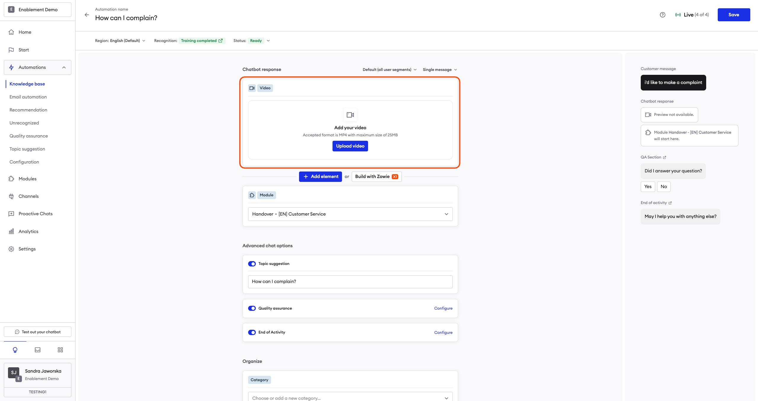
Video
This allows you to send users a video recording. The supported file format is MP4, and the maximum file size is 25 MB.
Note that this might not always be available in Creator.

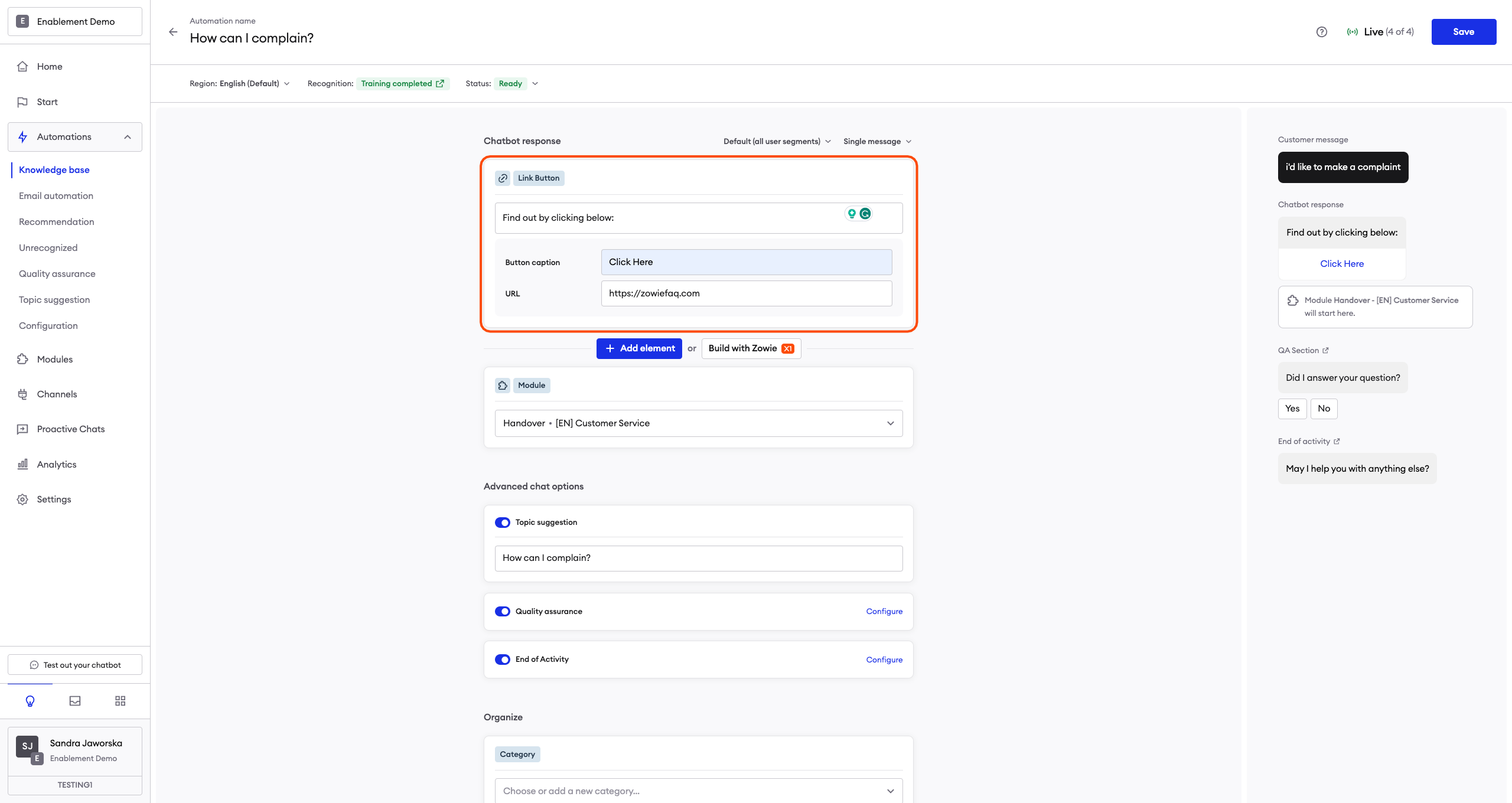
Link Button with URL
The Link Button element enables you to send a message with an embedded button that—when pressed—will redirect the user to the target website. You can even add a UTM link there to track how many users click the button! To configure a URL Button element, fill in the following fields:
- Message — the text present in the message;
- Caption — the caption on the button;
- URL field — paste your URL here with https:// in the beginning.
Note that the miximum length of the caption is 20 characters.
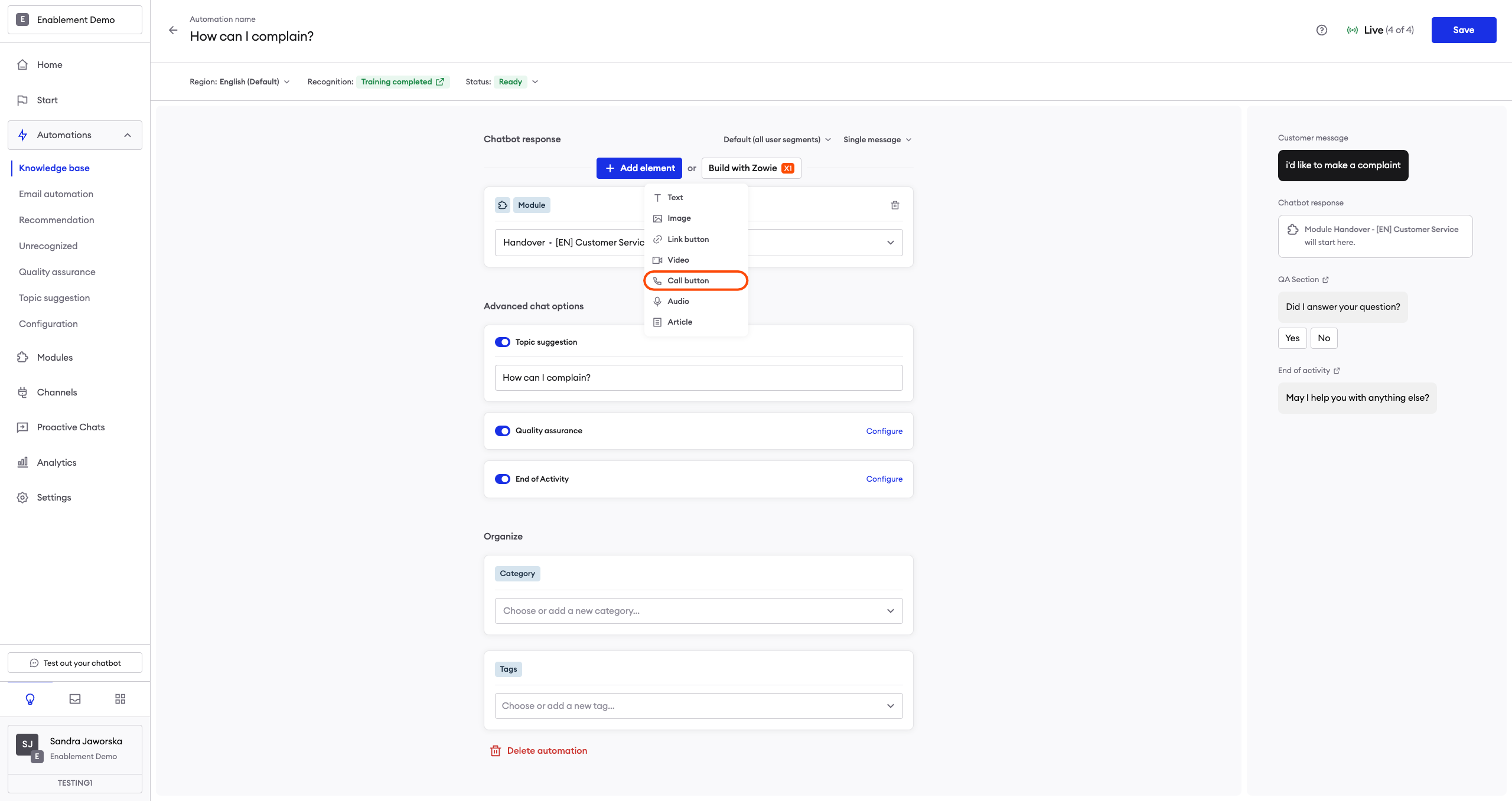
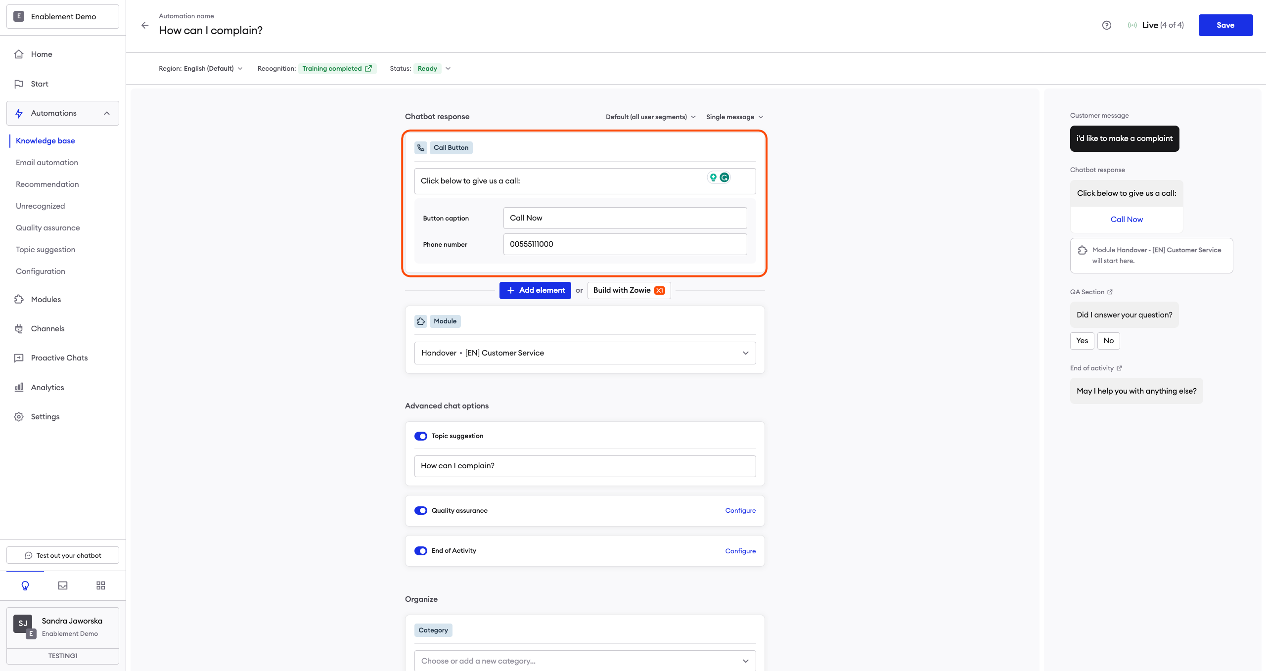
Call button
The Call Button element enables you to send a message with an embedded button that—when pressed—will open the user's default dialing app and enter the appropriate number. The user can quickly call the target place/person. This is particularly useful in delivering mobile app users a seamless chatbot experience.
To configure a Call Button element, fill in the following fields:
- Message — the text present in the message;
- Caption — is the caption on the button;
- Your phone number — don’t use dashes or spaces.
Note that desktop users may see this button, too (unless you use Segmentation to adjust the message for them). This is why you should use the phone number as caption, otherwise only mobile users will be able to click the button and call you.
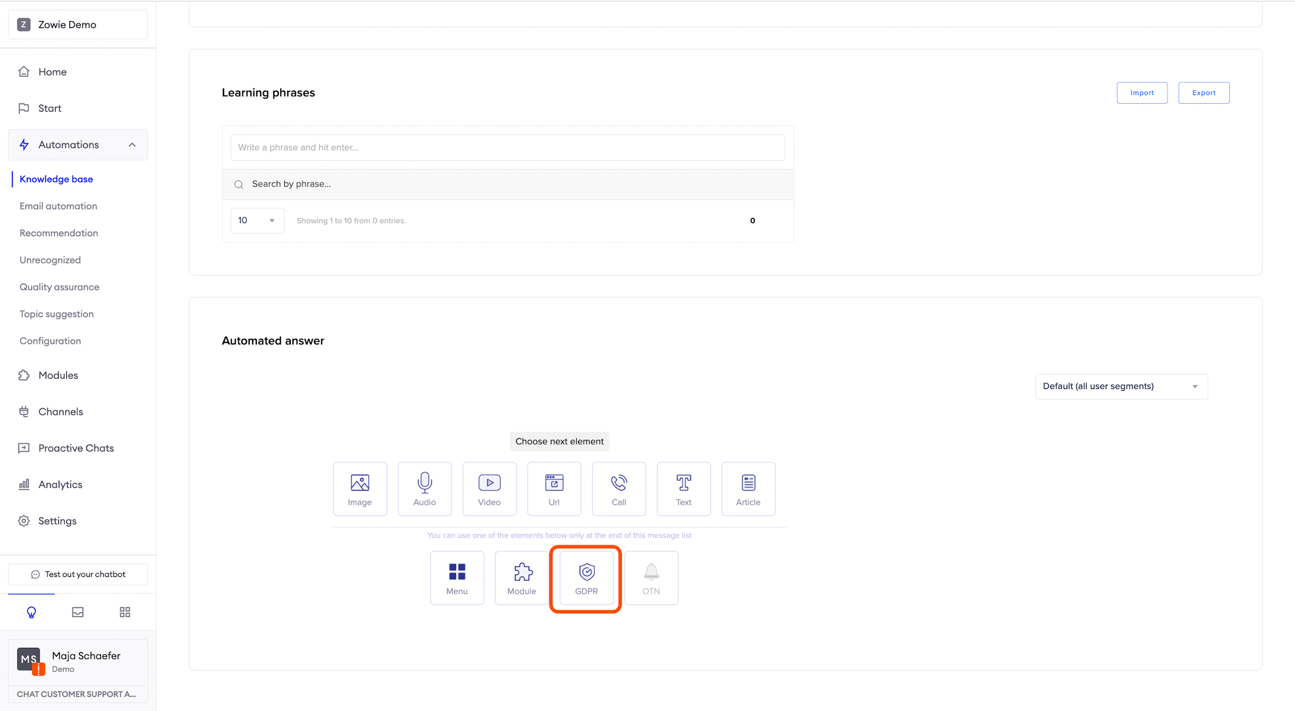
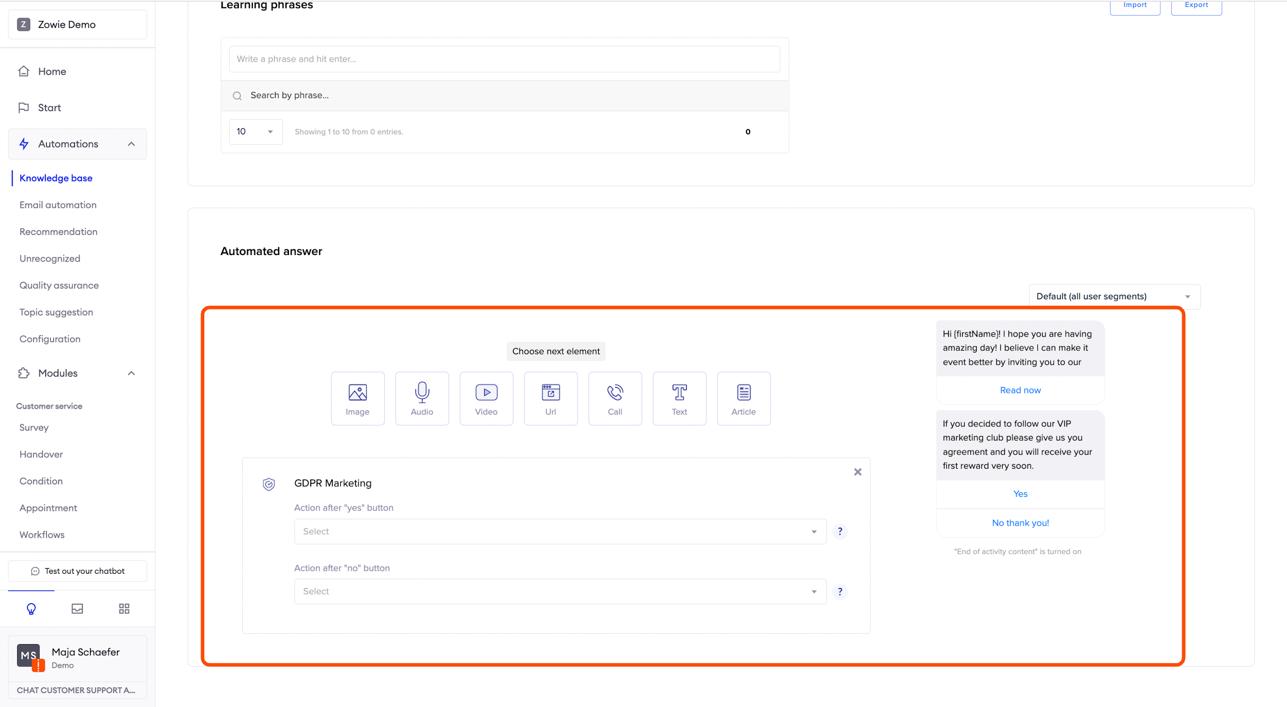
GDPR
The General Data Protection Regulation (GDPR) element allows you to send marketing agreements to users. The content of these messages is configured in the GDPR settings.
If the user has already agreed to receive marketing information, they’ll be automatically redirected to the module configured in the Action after the yes button.
You can configure two behaviors here:
- which module will be triggered if the user agrees (Action after yes button);
- which module will be triggered if the user disagrees (Action after no button).
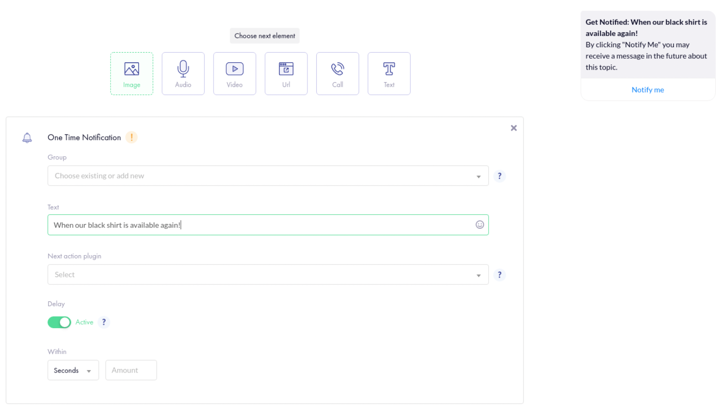
OTN
The One-time Notification element allows you to gather agreements for sending notifications to your users regarding one particular topic. The agreement is valid for a year and automatically expires.
To collect those agreements, create a Group. Name it appropriately—you’ll be able to target them from the Broadcast module under this name.
Then, in the Text field, provide the message to be sent after Get Notified.
Finally, select the Next action module. It’s triggered once the user agrees to receive the notification.
You can additionally configure a delay to trigger the Next action module.
On platforms other than Messenger, this element immediately redirects the user to the Next action module.
This element requires additional configuration in Facebook Page settings. You can read how to configure One-time Notifications here.
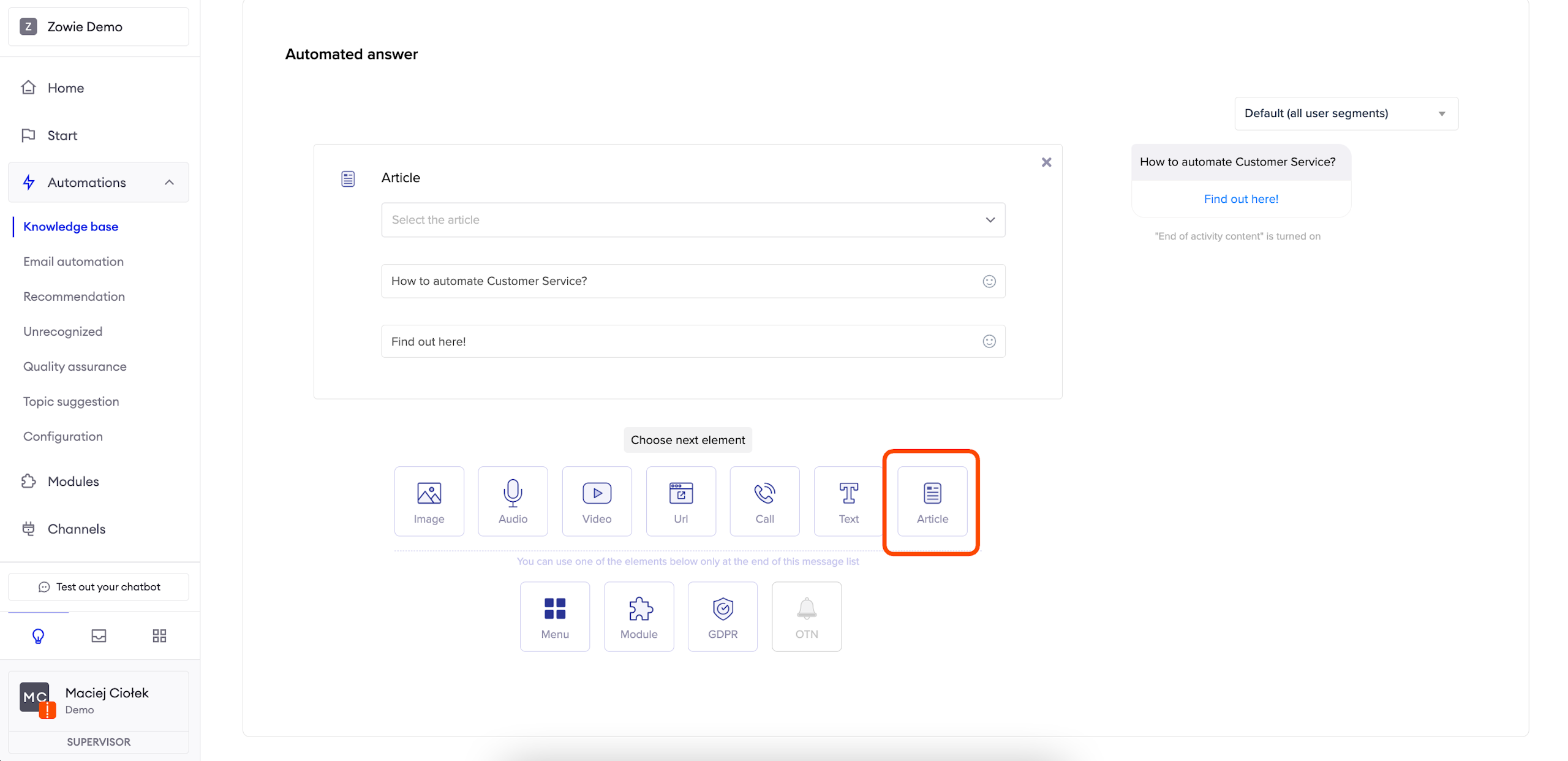
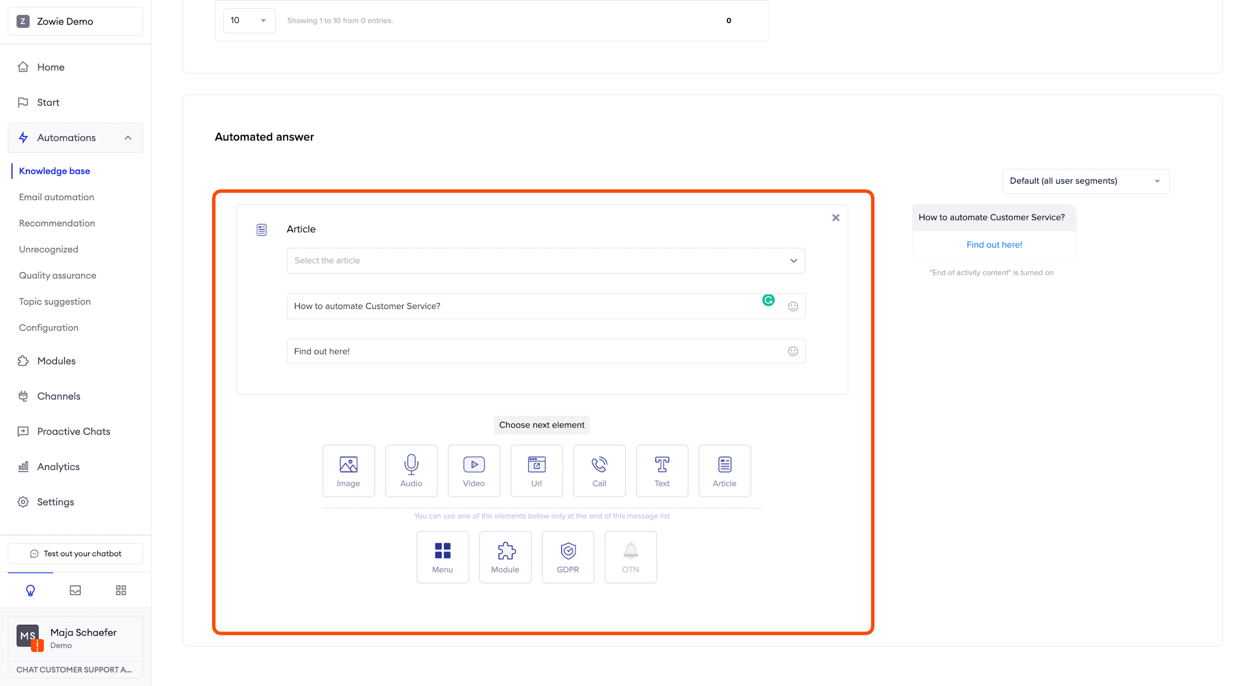
Article
The Article element allows you to link an article in your Zendesk knowledge base. After you configure the integration, you will be able to use the first field to select a relevant article. Then, simply add a message for your customers and a button caption.
AttentionRemember that you need to integrate your Zendesk knowledge base in order to select articles.
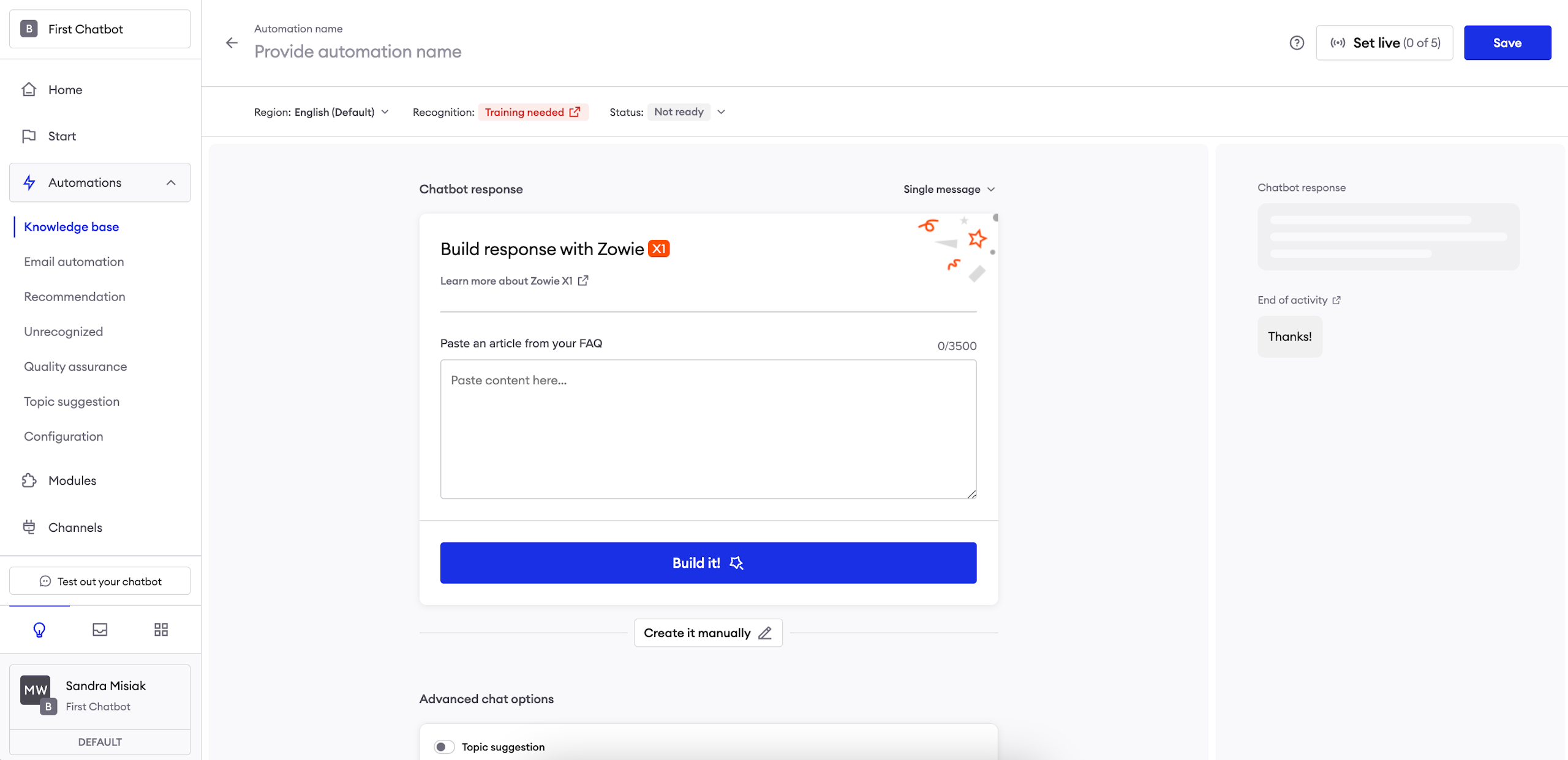
Zowie X1 Automated Response Builder
This feature allows you to effortlessly create a response for an automation using our Zowie X1. It allows you to save time by doing the creative work for you, ensures correct grammar and style and informs users about your company’s actual processes.
In order to use it, paste a fragment of your FAQ article (a large body of text) and let X1 do the rest - Zowie will use it to gather the most relevant information and describe it in a conversational way for your users.